
Insurance
•
Startup
•
B2C SaaS
Wefox Insurance Management App

Insurance
•
Startup
•
B2C SaaS
Wefox Insurance
Management App
Insurance
•
Startup
•
B2C SaaS
Wefox Insurance Management App
My Role
My Role
Design Team Lead &
Senior Product Designer
Team Lead & Sr. Product Designer
About the Client
WeFox is an insurtech simplifying digital insurances to empower users with smarter, more transparent coverage solutions.
Timeframe
Timeframe
4 months
03 — 07/2016
4 months • 03 — 07/2016
My Role
Team Lead & Sr. Product Designer
About the Client
Cara Care develops a SaaS medical App to improve the quality of life for people with digestive issues like IBS, IBD and others.
WeFox is an insurtech simplifying digital insurances to empower users with smarter, more transparent coverage solutions.
WeFox is an insurtech simplifying digital insurances to empower users with smarter, more transparent coverage solutions.
Timeframe
4 months • 03 — 07/2016
Achievements
&
Summary
Applied Services, Deliverables & Impact
Achievements
&
Summary
Applied Services, Deliverables & Impact
Achievements
Achievements
Achievements
Achievements
•
Introduced Sketch and founded the in-house design team, replacing outsourced workflows
•
Introduced Sketch and founded the in-house design team, replacing outsourced workflows
•
Introduced Sketch and founded the in-house design team, replacing outsourced workflows
•
Introduced Sketch and founded the in-house design team, replacing outsourced workflows
•
Mentored a Junior Designer, improving consistency, confidence and delivery speed
•
Mentored a Junior Designer, improving consistency, confidence and delivery speed
•
Mentored a Junior Designer, improving consistency, confidence and delivery speed
•
Mentored Junior Designer, improving consistency, confidence & delivery speed
•
Built a design system & CI manual, unifying product & brand across all media to a more premium appeal
•
Built a design system & CI manual, unifying product & brand across all media to a more premium appeal
•
Built a design system & CI manual, unifying product & brand across all media to a more premium appeal
•
End-to-end product design for three coaching products across web, mobile & desktop platforms
•
Improved information architexture with UX audits, hierarchy tweaks, and competitor analysis insights
•
Improved information architexture with UX audits, hierarchy tweaks, and competitor analysis insights
•
Improved information architexture with UX audits, hierarchy tweaks, and competitor analysis insights
•
Improved information architexture with UX audits, hierarchy tweaks, and competitor analysis insights
•
Redesigned key app screens to boost clarity, trust and user perception in 4 months
•
Redesigned key app screens to boost clarity, trust and user perception in 4 months
•
Redesigned key app screens to boost clarity, trust and user perception in 4 months
•
Redesigned key app screens to boost clarity, trust & user perception
•
Extended product to web by redesigning the Website including new User-dashboards
•
Extended product to web by redesigning the Website including new User-dashboards
•
Extended product to web by redesigning the Website including new User-dashboards
•
Extended product to web by redesigning the Website including User-dashboards
•
Supported marketing with print, merch, and guidance for a nationwide TV ad campaign
•
Supported marketing with print, merch, and guidance for a nationwide TV ad campaign
•
Supported marketing with print, merch, and guidance for a nationwide TV ad campaign
•
Supported marketing with print, merch & guidance for a national TV campaign
Summary
Summary
Summary
Summary
+0.7
+0.7
+0.7
★
★
★
avg. Store Rating
+0.7
+0.7
+0.7
★
★
★
avg. Store Rating
7
7
7
+
+
+
Core-Screens redesigned
7
7
7
+
+
+
Core-Screens redesigned
70
70
70
+
+
+
Icons designed
70
70
70
+
+
+
Icons designed
When I joined WeFox, the product lacked a clear UX structure, visual coherence & polish and internal design ownership.
Over the course of 4 months, I led a comprehensive redesign of the core app experience, introduced the first design system + CI manual and helped extend the product from mobile to web.
These efforts elevated user trust & clarity and laid the foundation for long-term design scalability with a measurable boost in app store perception.
When I joined WeFox, the product lacked a clear UX structure, visual coherence & polish and internal design ownership.
Over the course of 4 months, I led a comprehensive redesign of the core app experience, introduced the first design system & CI manual and helped extend the product from mobile to web.
These efforts elevated user trust & clarity and laid the foundation for long-term design scalability with a measurable boost in app store perception.
When I joined WeFox, the product lacked a clear UX structure, visual coherence & polish and internal design ownership.
Over the course of 4 months, I led a comprehensive redesign of the core app experience, introduced the first design system + CI manual and helped extend the product from mobile to web.
These efforts elevated user trust & clarity and laid the foundation for long-term design scalability with a measurable boost in app store perception.
When I joined WeFox, the product lacked a clear UX structure, visual coherence & polish and internal design ownership.
Over the course of 4 months, I led a comprehensive redesign of the core app experience, introduced the first design system + CI manual and helped extend the product from mobile to web.
These efforts elevated user trust & clarity and laid the foundation for long-term design scalability with a measurable boost in app store perception.
Applied Services & Skills
IC & Team Lead
IC & Team Lead
Research, Concept & Ideation
Research, Concept & Ideation
Branding & Corporate Identity
Branding & Corporate Identity
Product Design
Product Design
Digital & Print Media Design
Digital & Print Media Design
Audit, Testing & QA
Audit, Testing & QA
No Design Foundation
&
Guidance
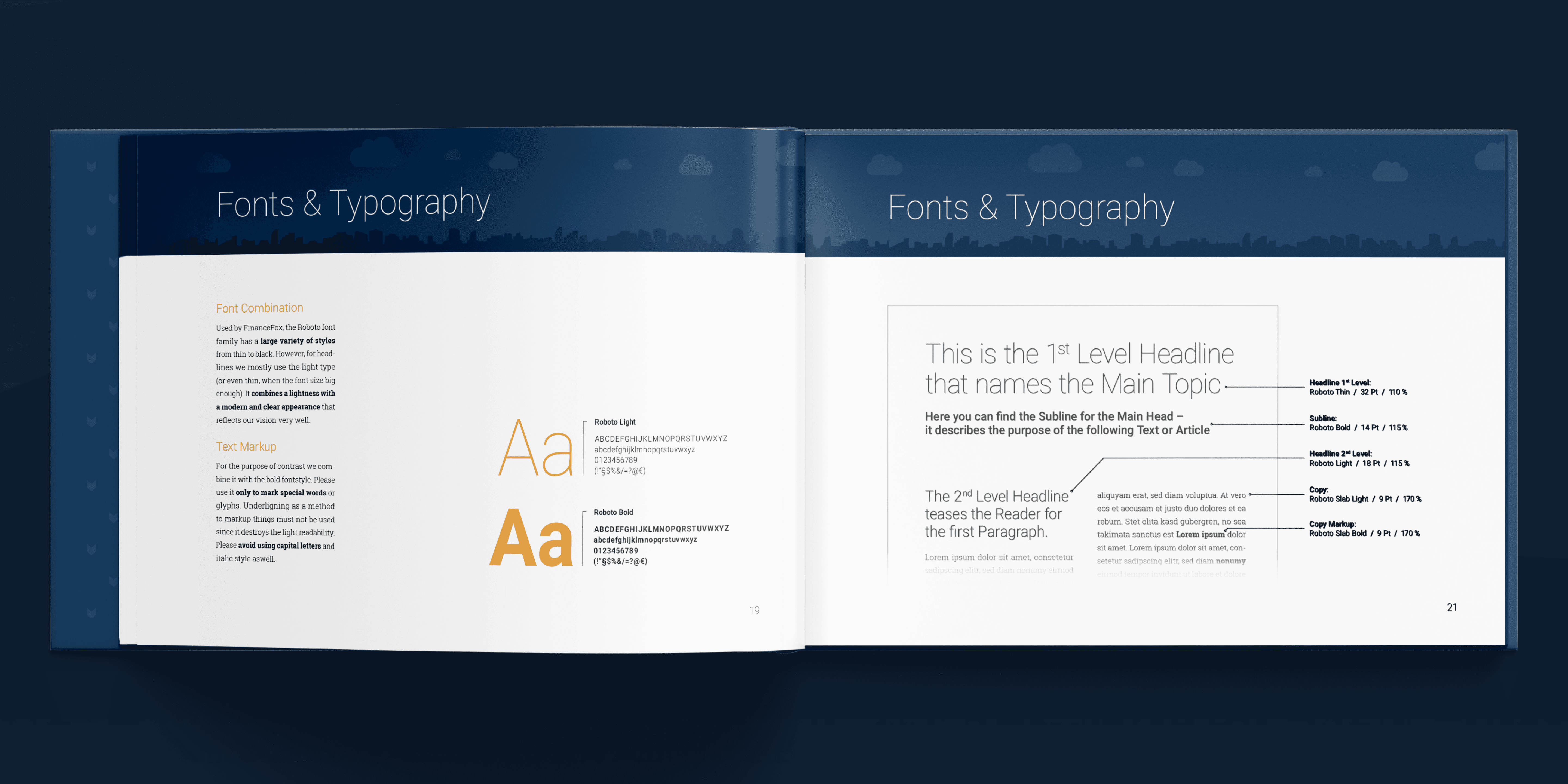
Establishing the company’s first design system and CI guide.
No Design Foundation
&
Guidance
Establishing the company’s first design system and CI guide.
No Design Foundation
&
Guidance
Establishing the company’s first design system and CI guide.
No Design Foundation
&
Guidance
Establishing the company’s first design system and CI guide.
Challenge: Design & handovers were inconsistent and hard to scale
Challenge: Design & handovers were inconsistent and hard to scale
With no basic design language in place, product design with multiple designers and handoffs to developers & external contractors were inefficient and error-prone. Brand communication varied wildly between channels.
With no basic design language in place, product design with multiple designers and handoffs to developers & external contractors were inefficient and error-prone. Brand communication varied wildly between channels.

Solution: CI manual & reusable component system
Solution: CI manual & reusable component system
I documented core design principles, components and brand visuals into a Corporate Design manual. This resource improved consistency across touchpoints and became the foundation for future internal & external design efforts.
I documented core design principles, components and brand visuals into a Corporate Design manual. This resource improved consistency across touchpoints and became the foundation for future internal & external design efforts.
Incoherent Appeal
&
Iconography
Creating a scalable UI system to match the brand’s premium positioning.
Incoherent Appeal
&
Iconography
Creating a scalable UI system to match the brand’s premium positioning.
Incoherent Appeal
&
Iconography
Creating a scalable UI system to match the brand’s premium positioning.
Incoherent Appeal
&
Iconography
informed Decisions towards Product Market Fit
Challenge: Mismatched icon styles and inconsistent UI patterns
Challenge: Mismatched icon styles and inconsistent UI patterns
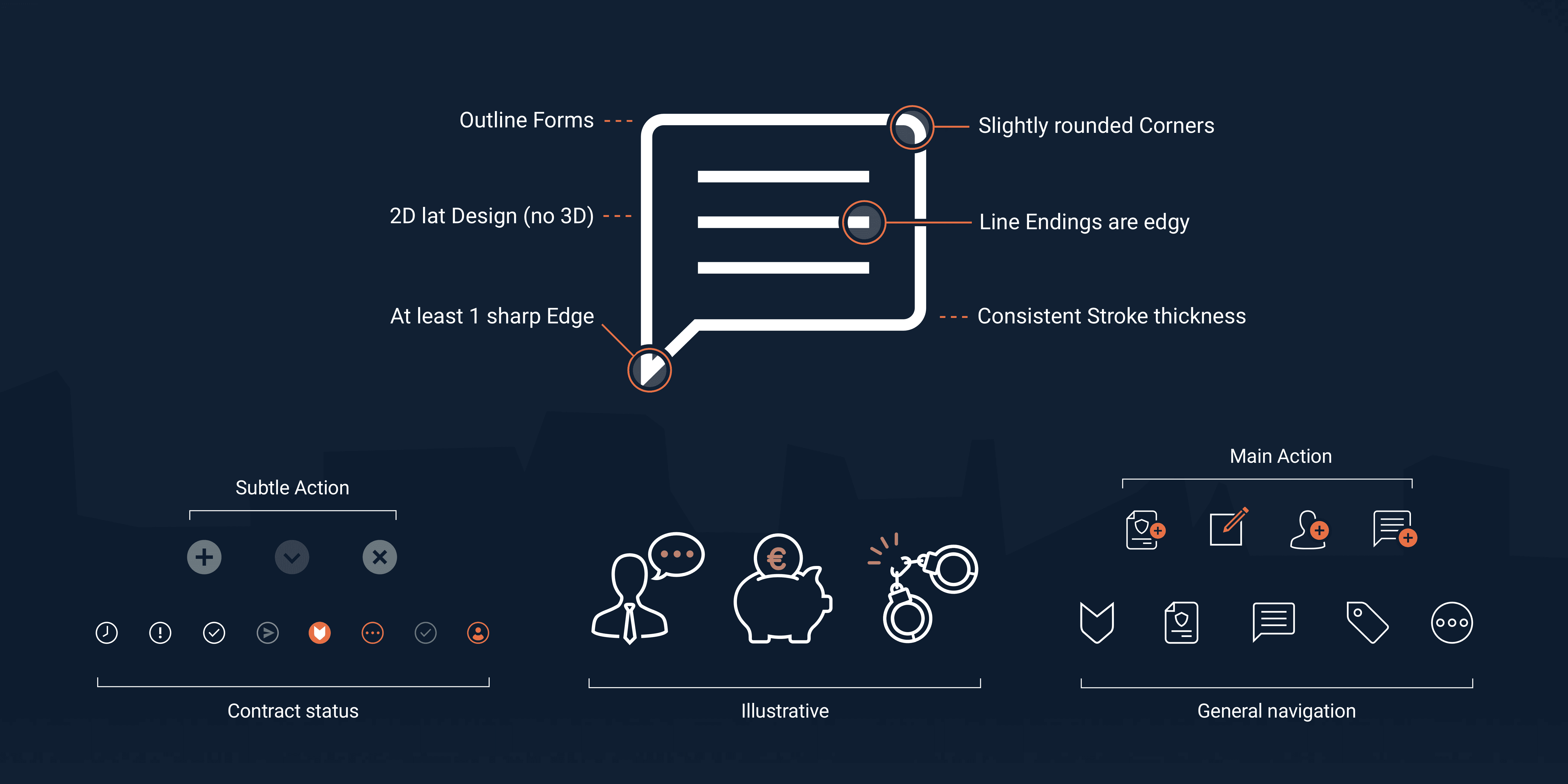
The icon set was fragmented, visually clunky and communicated the opposite of the company’s high-quality, service-first positioning. There was also no shared library or style guide for the team or external partners.
With several designers working on different verticals with varying data & feature complexity, maintaining a unified design language & code base was a constant balancing act. Each game required rapid iteration and app-specific tweaks, but still had to feel like “SUMO.”
Solution: visual system foundation & Icon redesign
Solution: visual system foundation & Icon redesign
I redesigned necessary icons using a sharp, outline-based style with selective color accents. This visual logic became the basis of a more premium-feeling interface that aligned across product and marketing channels.
I redesigned necessary icons using a sharp, outline-based style with selective color accents. This visual logic became the basis of a more premium-feeling interface that aligned across product and marketing channels.
Visual Clutter
&
User Trust
Clarifying the core user experience across screens that lacked structure and hierarchy.
Visual Clutter
&
User Trust
Designing consistent user value despite fragmented & inconsistent data sources
Visual Clutter
&
User Trust
Clarifying the core user experience across screens that lacked structure and hierarchy.
Varying Constraints
&
Unified Experience
Clarifying the core user experience across screens that lacked structure and hierarchy.
Challenge: Confusing layouts and unclear value
Challenge: Confusing layouts and unclear value
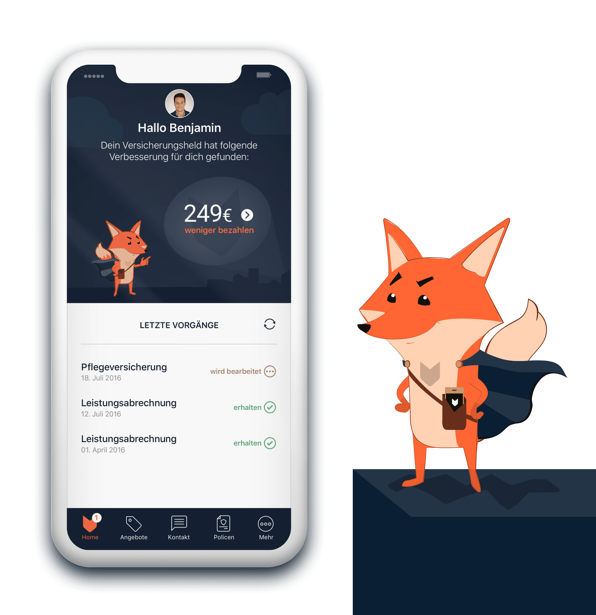
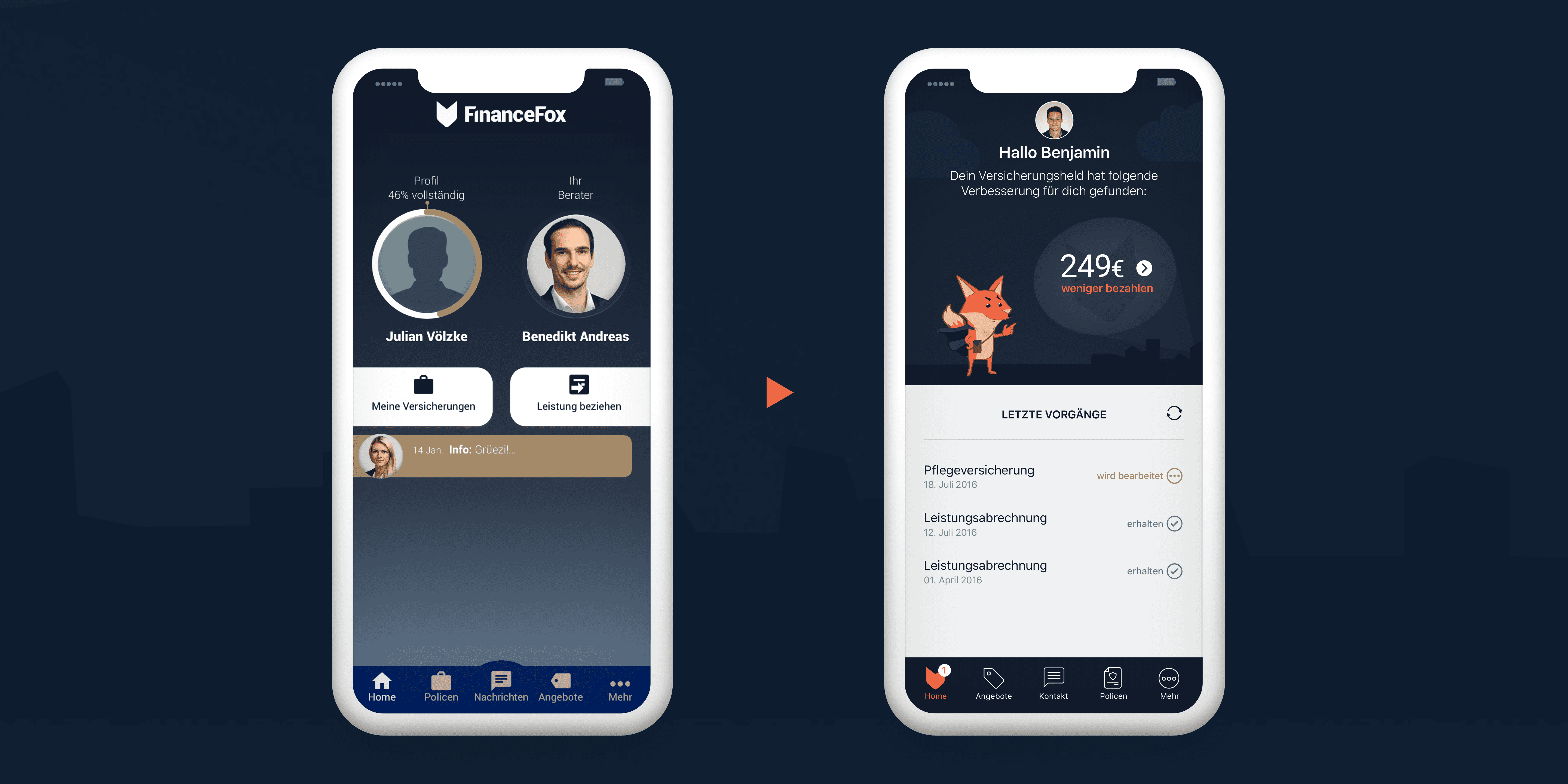
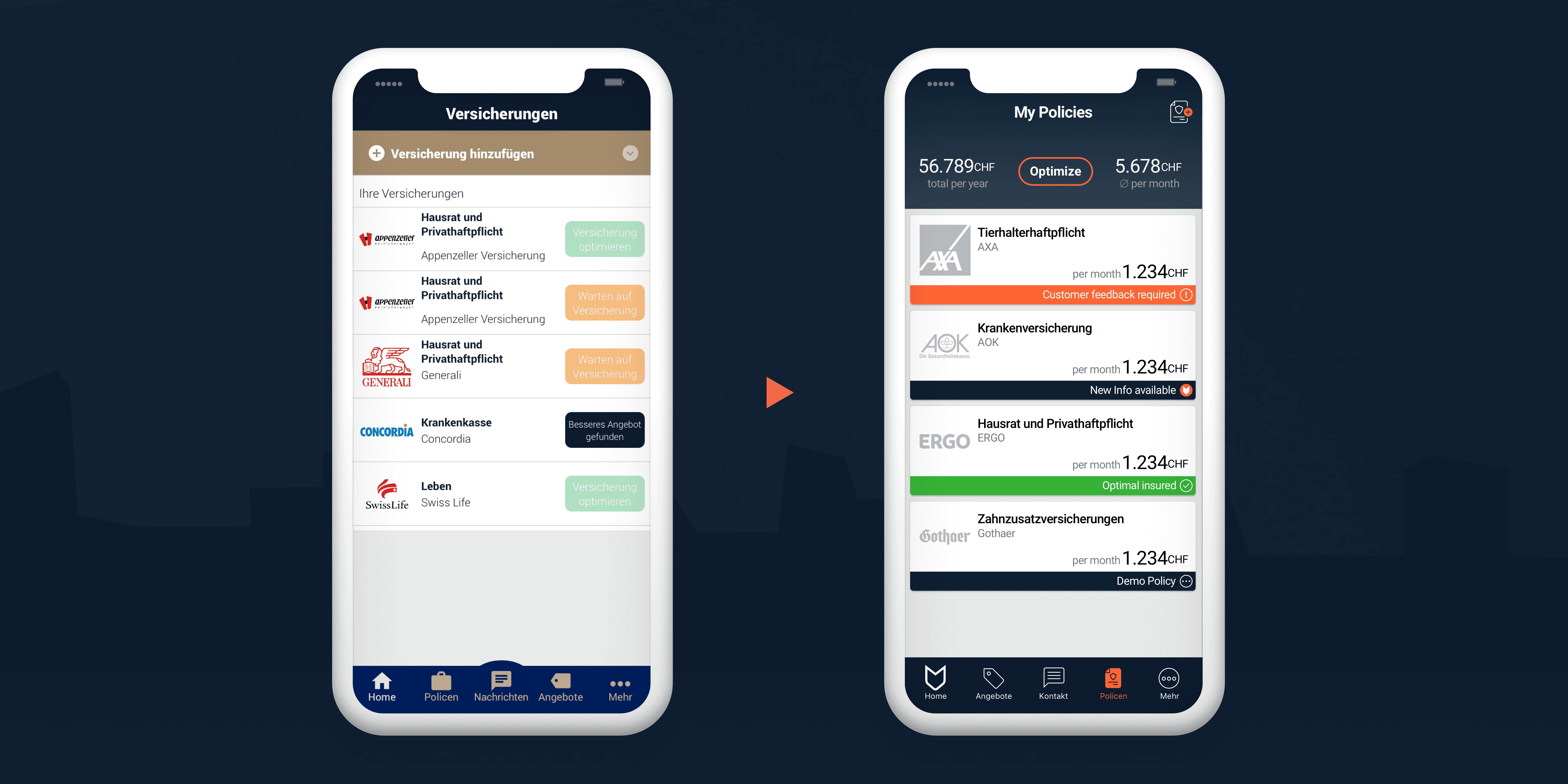
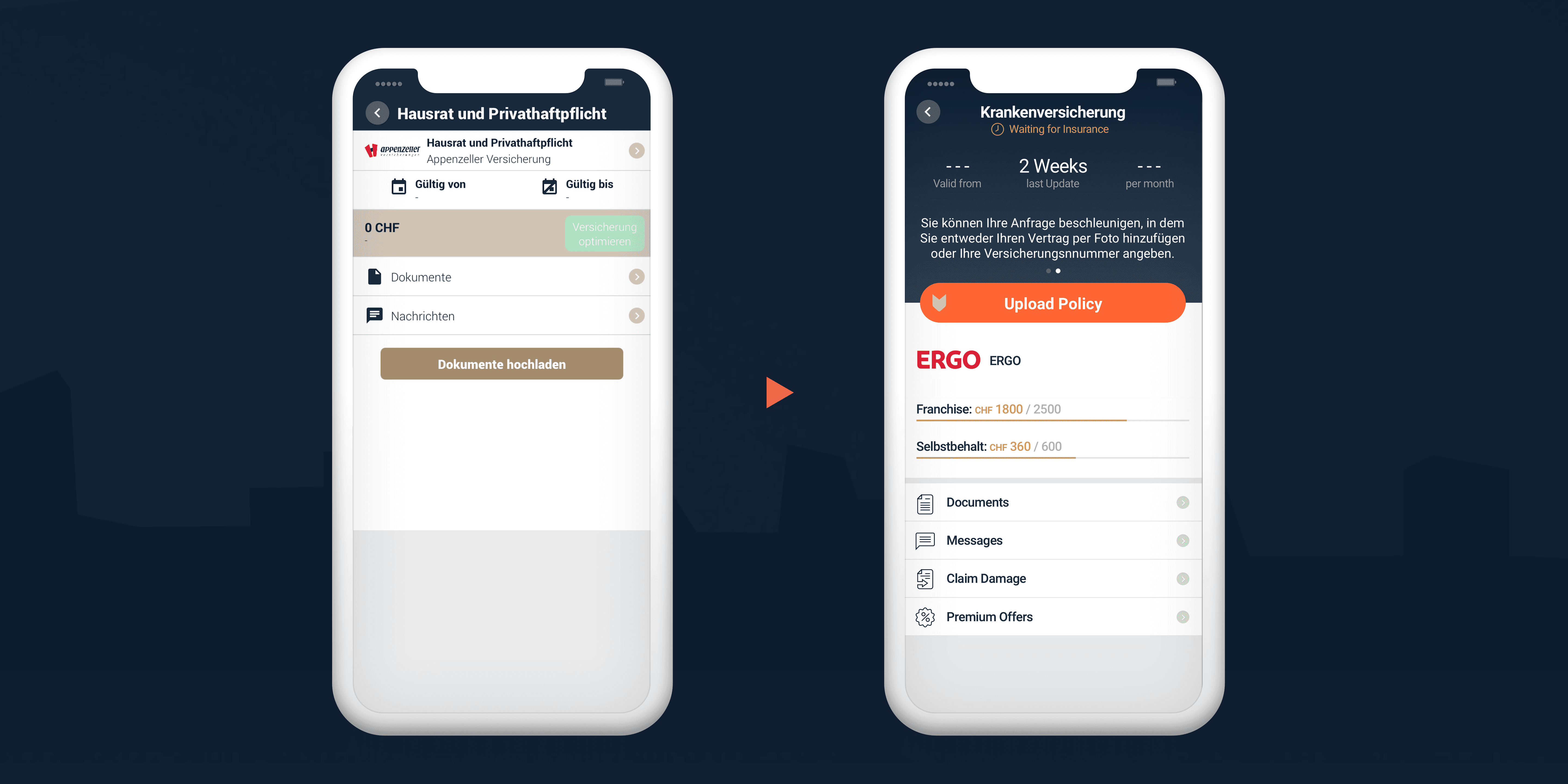
The original app UI was visually noisy, structurally inconsistent and lacked visual guidance. Key user flows like the home screen, insurance overview and detail screens weren’t communicating trust or value, especially for first-time users.
The original app UI was noisy, structurally inconsistent and lacked visual guidance. Key user flows like the home screen, insurance overview and detail screens weren’t communicating trust or value, especially for first-time users.
The original app UI was visually noisy, structurally inconsistent and lacked visual guidance. Key user flows like the home screen, insurance overview and detail screens weren’t communicating trust or value, especially for first-time users.
Solution: UX overhaul & clarity-first redesign
Solution: UX overhaul & clarity-first redesign
I restructured key screens with a more clear and actionable information architecture to highlight spending insights, contract statuses and service options. Card-based layouts and a clearer hierarchy helped guide users through critical tasks like uploading insurance documents or viewing contract details.
I restructured key screens with a more clear and actionable information architecture to highlight spending insights, contract statuses and service options. Card-based layouts and a clear hierarchy helped guide users through critical tasks like uploading documents or viewing contract details.
I restructured key screens with a more clear and actionable information architecture to highlight spending insights, contract statuses and service options. Card-based layouts and a clearer hierarchy helped guide users through critical tasks like uploading insurance documents or viewing contract details.
Mobile-Only Product
&
Marketing Presence
Bringing the product to desktop and supporting brand storytelling.
Mobile-Only Product
&
Marketing Presence
Bringing the product to desktop and supporting brand storytelling.
Mobile-Only Product
&
Marketing Presence
Bringing the product to desktop and supporting brand storytelling.
Mobile-Only Product
&
Marketing Presence
From News-Feed to platform specific use-case split
Challenge: Extending UX beyond mobile while building brand credibility
Challenge: Extending UX beyond mobile while building brand credibility
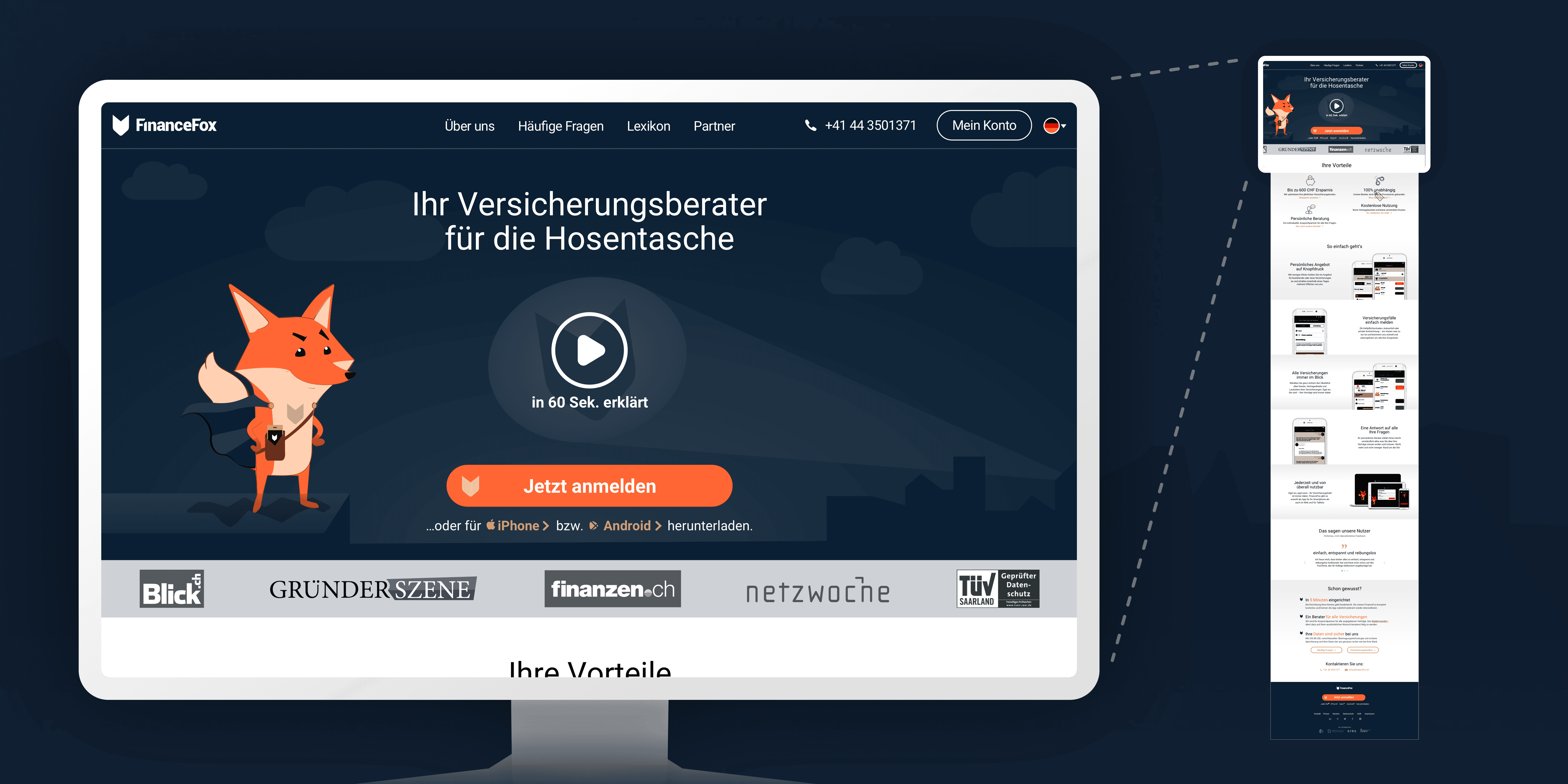
The original product experience existed only on mobile. As the product matured, the team needed a responsive web experience and a new landing page that could communicate value to both users and potential investors.
Introducing a subscription-based model was uncommon at the time, especially in game companion apps. On top of that, our core value depended on third-party data sources that occasionally failed or changed.
Solution: Responsive website redesign & marketing support
Solution: Responsive website redesign & marketing support
I overhauled the core website, including dashboards for logged-in users and collaborated on guidance & visual assets for WeFox’s first major TV commercial, print campaigns and promotional merchandise to increase apation rate.
We designed upgrade flows that clearly communicated added value, using tiered features like ad removal, in-depth analytics, and custom coaching. When data outages occurred, we prioritized transparency and timely communication of details & expected duration to maintain user trust.
Summary
&
Reflection
Distilling the essence of Digital Product Design
Summary
&
Reflection
Distilling the essence of Digital Product Design
Summary
&
Reflection
Distilling the essence of Digital Product Design
Summary
&
Reflection
Distilling the essence of Digital Product Design
Outcome
Outcome
I moved WeFox from an outsourced, visually inconsistent product to a design-focussed brand with scalable foundations — all within just a few months.
The redesign improved UX clarity across key screens, boosted user trust in a sensitive service context, and enabled faster iteration through reusable design components.
With the new design system, icon language, and CI manual in place, the team could confidently scale across web, print, and external collaborations — while the app’s improved usability and visual polish contributed to a noticeable increase in user satisfaction and store ratings.
+0.7
+0.7
+0.7
★
★
★
avg. Store Rating
+0.7
+0.7
+0.7
★
★
★
avg. Store Rating
7
7
7
+
+
+
Core-Screens redesigned
7
7
7
+
+
+
Core-Screens redesigned
70
70
70
+
+
+
Icons designed
70
70
70
+
+
+
Icons designed
Reflection
Reflection
This project was a pivotal moment shifting from solving screens to shaping systems to find the balance between execution & future proofing.
The experience shaped how I approach rapid impact, team enablement, and cross-disciplinary collaboration to this day.
This project was a pivotal moment shifting from solving screens to shaping systems to find the balance between execution & future proofing.
The experience shaped how I approach rapid impact, team enablement, and cross-disciplinary collaboration to this day.
Want to talk?
Want to talk?
Want to talk?
No matter if you want to talk about your current / future product, problems to solve or just want to discuss design philosophy —
Just book a quick 15 minute call and I will curiously unpack your story to see where our potential overlap might take us.
No matter if you want to talk about your current / future product, problems to solve or just want to discuss design philosophy —
Just book a quick 15 minute call and I will curiously unpack your story to see where our potential overlap might take us.
No matter if you want to talk about your current / future product, problems to solve or just want to discuss design philosophy —
Just book a quick 15 minute call and I will curiously unpack your story to see where our potential overlap might take us.

© 2026 Benjamin Erxleben
All rights reserved
© 2026 Benjamin Erxleben
All rights reserved